

This post discusses problems related to measuring road injury risk, but substantively takes a look at cycling risk by London borough, via an attempt to estimate cycling volumes by borough via DfT counts and pct.bike.
So, I’ve been doing some analysis with a view to putting in some evidence to the London Assembly Bus Investigation.
In particular I’m interested in Question 12: Are there any problems caused by bus and cycling infrastructure sharing road space (particularly kerb side) and how could these be resolved?
I’m interpreting this as referring to shared bus and cycle lanes, and thought I’d look at an under-researched issue – the safety of cyclists in shared bus lanes. More on this in due course. However, looking into this issue brought up an old problem when using routinely collected data to look at risk: namely, we count road injury collisions in a manner that, while not counting all collisions, is at least comparable between areas, but getting that crucial denominator (out of how many cyclists?) is the really hard bit.
That denominator is especially a problem, when a particular type of infrastructure, whether it be a cycle track or a shared bus lane, is likely to affect the numbers of cyclists who might choose to use that road. For example: we wouldn’t want to conclude that a type of infrastructure was riskier than an alternative route type, if it actually kept people safer but also encouraged more cyclists to divert to it – leading to a higher number of collisions than on the alternative route type, but a lower number of collisions per cyclist.
But it’s often really difficult to get hold of the denominator, so studies end up looking at factors associated with crash sites, but without having a sure sense of the extent to which we’re talking about more risk per cyclist, or more cyclists in the first place.
Many more cycle injuries in Hackney than Barnet. Does that imply Barnet must be safer for cycling? (Clue: No.)
This denominator problem can also be a problem for making comparisons between areas. A nice piece of analysis by advocacy group Cycling UK compared Census 2001 levels of cycling with numbers of cycle collisions. For most local authorities in England and Wales, taking cycle commuting by residents as a proxy for volumes of cyclists on the network within an area is probably not too bad, especially as we know that commuter cycling is a reasonably good area-level proxy for all cycling.
For bigger cities though, taking local authority-level resident trip rates as a proxy for cycling volume doesn’t work so well (hence the CUK analysis treated Greater London, Greater Manchester and Liverpool as separate items, rather than using individual boroughs within those conurbations). London is made up of 33 local authority districts. A trip may well take in more than one London borough – for instance, the part of Camden that’s in Central London is only 1.5km wide. That mightn’t matter so much if out-of-borough cycle trips were evenly distributed – for instance, if a commuter in Hackney was just as likely to be riding to Newham or Redbridge as to City of London or Westminster.
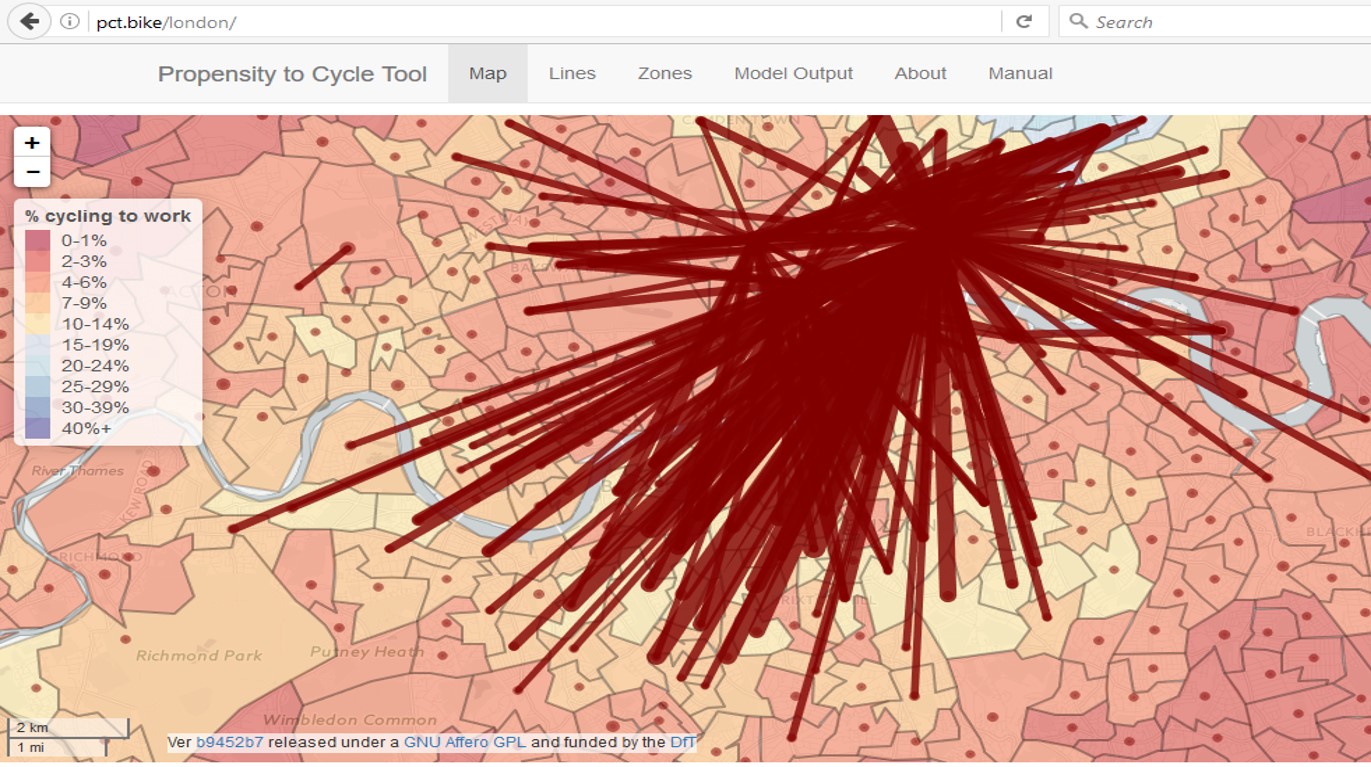
Top cycle commuting flows in South London, courtesy of pct.bike
But we know that cycle commuting trips aren’t like this. When my commute was from Hackney to Beckton, I encountered few other cyclists along the route. Now I’m riding from Hackney to Westminster, it’s quite a different story. Inner London’s cycle commuters (and this is where cycle commuting is highest) are generally headed to the centre. Therefore, if we take cycle commuting rates per borough as a proxy for cycling volume in each borough, when looking at injury rates, we’ll probably end up with systematic bias.
Here’s an interesting chart, then. It compares the number of residents commuting by bike (on the left axis, from the Census 2011) with a measure that I’ve derived for cycle volume in each borough’s A roads (right axis).
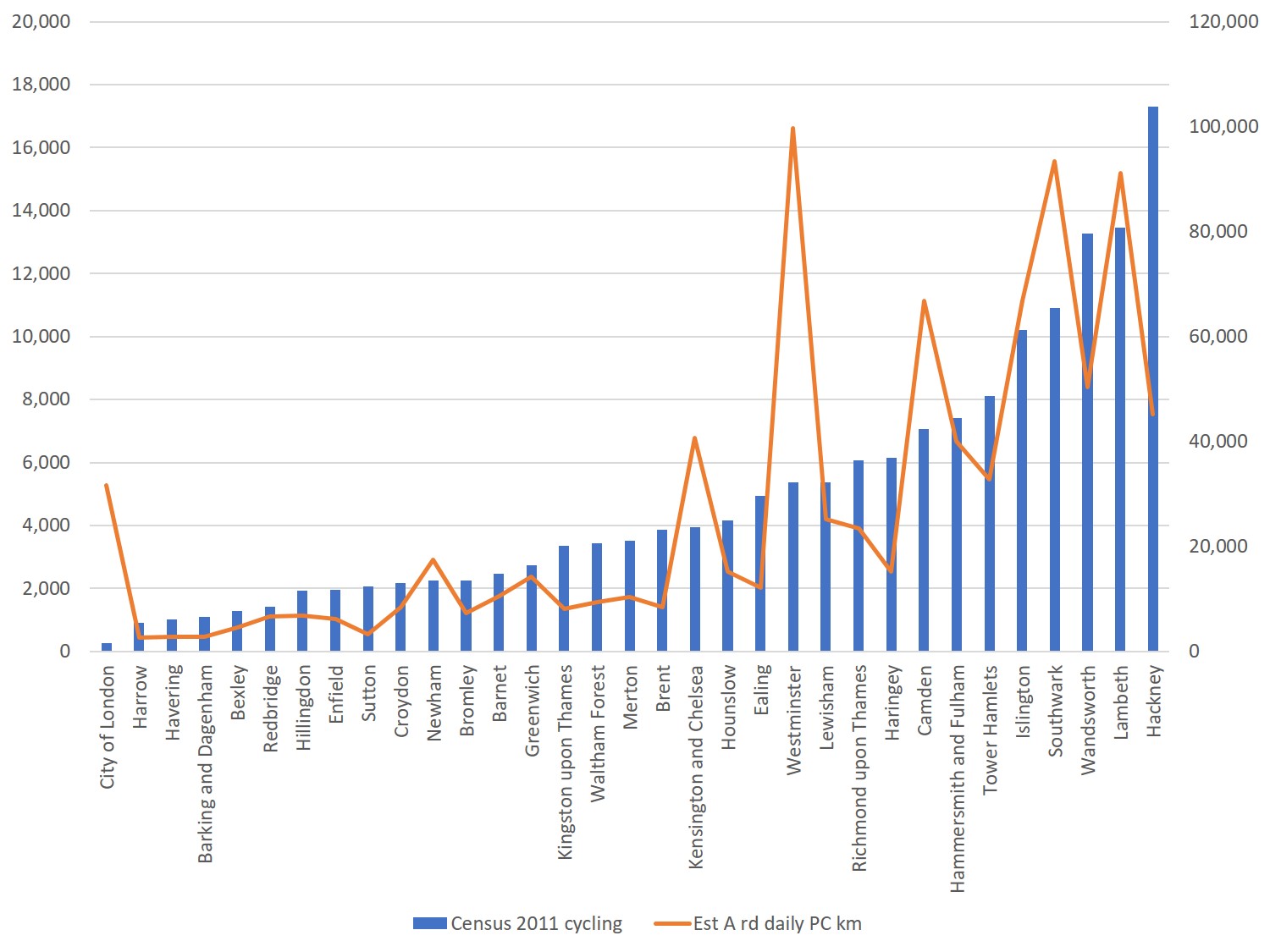
Comparing Census 2011 cycle commuting by borough, with my estimate of A road cycle km.
How did I get to my cycle volume measure? Firstly, I took all the DfT A road count sites, and averaged (using means) the figures given for cycle traffic for the years 2012-5. Then I averaged all these within a borough, to give the average number of cyclists at an A road count site in each borough, for those years. Finally, I obtained a measure of the km of A road in each borough from DfT road length tables. I used the road length from 2015, on the grounds that amounts of A roads in London are pretty stable.
This gave me a measure of A road cycling volume per borough (DfT have few count sites on minor roads, so I wasn’t confident to look at this on a borough level). Of course, it’s a pretty rough assumption in terms of kilometres – but what it does do, is give a sense of how boroughs compare against each other on this measure.
And clearly, the resultant graph shows that because of the nature of London’s land use geography and commuting flows, borough-level cycle commuting isn’t a great proxy for volumes of cyclists on the A roads (at least). For instance, Westminster stands out as having few cycle commuters living in the borough, but very high volumes of cycling (according to my estimate of A-road flow).
But is my estimate any good? (Not in estimating actual kilometres that accurately, but in providing us with a metric that compares boroughs fairly). At this point I had a brainwave. I realised that I could use the PCT route network feature (which routes commuter cyclists to the most direct routes on the network) to estimate commuter cycling levels within boroughs, and then compare that with my A-road estimate. Pulling the London PCT route network into QGIS, I associated route segments with boroughs, and then for each segment calculated cycle kilometres using the PCT commuter numbers and the length of the segment.
Now clearly the PCT has limitations – for one thing, cyclists may use less direct routes; it doesn’t capture all commuter cycling (or indeed non-commuter cycling), and so on (see Lovelace et al and the PCT manual for more on these limitations). But, the key thing here is that (a) I’m after borough-level information, not route-level, so differences in routes followed between a given origin and destination are not so crucial and (b) I’m not looking for exact numbers per borough, but rather a metric that can accurately rank and compare boroughs.
So, I then compared the PCT metric with my A road metric and the results were better than I’d expected. While for the previous graph, the R-squared value (a statistical measure between 0 and 1, showing how close the data are to a fitted regression line) was under 0.5 for a linear relationship, here it’s almost 1; 0.95.
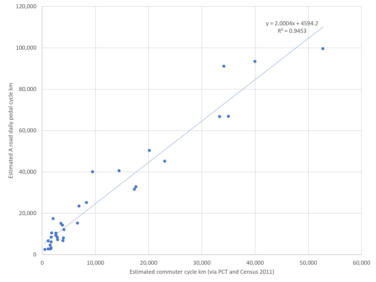
Comparing PCT derived figures on commuter cycle volumes per borough, with my A road estimated cycle flows.
Both correlations are looking at a Census-derived measure, but clearly one works a lot better than the other in terms of being able to compare flows, rather than only borough of origin.
Now to get to the point (for those less interested in methodological discussion). Let’s use that PCT measure of commuter cycling flow to compare the number of cycling injuries in each London borough. (It would be even better to be using a measure of all cycling flow, which isn’t available via the PCT but could potentially be done with TfL’s new CYNEMON model. Still, at least the commuter volume measure seems very closely correlated with my estimate of all cycling on A roads by borough).
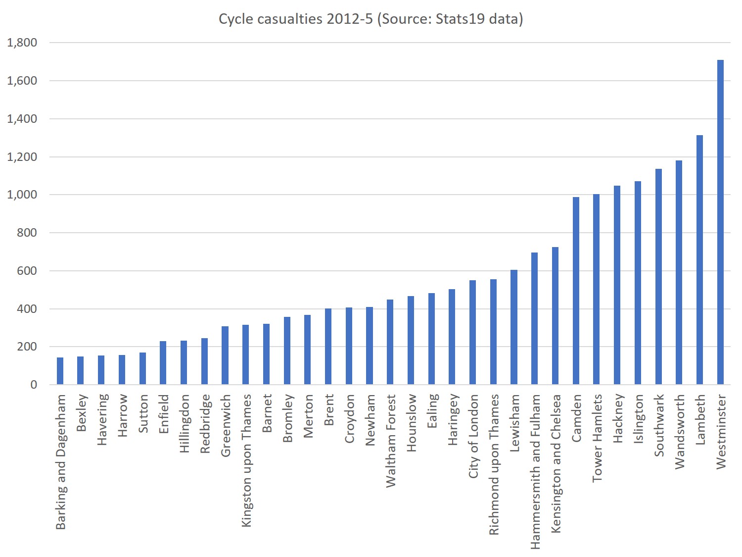
Cycling injuries by borough – but where’s safer?
Above we can see the absolute numbers of collisions per London borough. Many collisions take place in the centre of London, and immediately to its South and North-East, focusing attention on some very unpleasant roads and junctions there.But when we use the PCT-derived commuter cyclist volume to explore relative risks, things look a bit different – and to me, three things stand out.
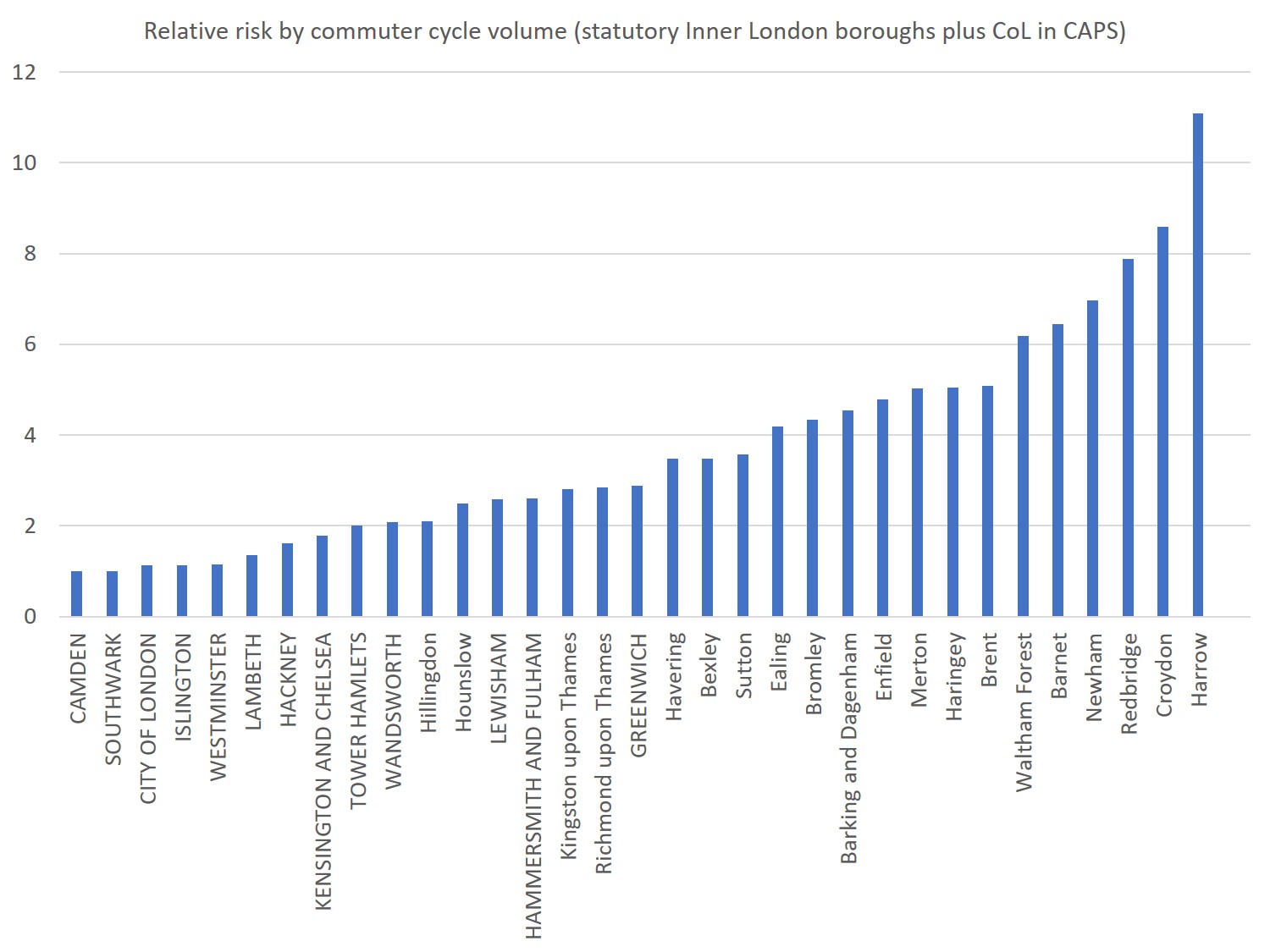
Comparing relative risks by borough (Camden, with the lowest risk, set to 1)
Firstly, a whole cluster of Central/Inner London boroughs have very similar risks – Camden, Southwark, City of London, Islington, Westminster, Lambeth, Hackney, Kensington and Chelsea and Tower Hamlets are all within the same ballpark.
Secondly, this ballpark, while best in class, is not an amazing place to be. Summing all the volumes and injuries, we get to an average risk across London roughly similar to the risk in Tower Hamlets or Kensington and Chelsea. No borough is massively better than that – at best, Camden has half the risk. And we know that the risk across London is much higher than it should be. Copenhagen, with almost as many kilometres cycled daily as London, has 0-1 annual deaths, London more like 10-15. As of 2012-15, no borough seemed to have made a decisive impact on cycling injury risk, in these terms.
Finally, the data points to some very high risks in Outer London, where there is also massive amounts of unmet cycling potential. In many Outer London boroughs, the risk per commuter cycle kilometre seems around 5-10 times higher than in Camden, which as per above is still not great itself, in international context.
A few points to make here Rachel:
1. I would tend not to use DfT counts – various colleagues have pointed out to me in the past that they were poor. So it’s good you are using a new way to try and get accurate numbers of people cycling.
2. Cyclist deaths are actually below 10 annually now (prior to 2000 used to be 15 – 20). Deaths are also in 50% of cases associated with a particular kind of collision, namely with HGVs. 90% of cyclist KSIs are NOT associated with HGVs. Which brings us to:
3. What are using for “injuries”? It looks to me like you are using Slight Injuries in there – and Slight are notoriously unreliable/invalid. Generally most researchers choose KSIs (Killed and Seriously Injured), made up of 10 – 20 Serious Injuries for each death.There are issues with non-reporting of Serious Injuries, but the proportion non-reported seems to be constant, so you can use them to assess trends. But Slight Injuries have not only got a lot of non-reporting, but seem to have differing rates of non-reporting. So there is an issue of which figures you use – I would try restricting yourself to KSIs
4. For explanations, a key factor differentiating Outer and Inner London is speed – much more of an issue in Outer London.
5. The other issue is Safety in Numbers – there may be a SiN effect in those Boroughs which have highest concentrations of cyclists, which seem to correlate with those with lower risk, at my rough impressionistic estiamte anyway.
Hope this helps with going forward.
Hi Bob, thanks for the comments, interesting as always 🙂 Briefly in response –
1. It’s interesting that there was such strong correspondence between PCT modelled flow and the DfT counts at borough level. So I actually now think the DfT counts are more useful than I did previously, for estimating local authority-level volume at a point in time, at any rate.
2. In 2010-14, London cycling deaths were between 10 and 16 per year (see https://data.london.gov.uk/dataset/pedal-cyclist-casualties-killed-and-seriously-injured/resource/cebb2927-f8df-45f3-bf25-13ec778cd959). And it was over 10 in 2016 – so I think I’m ok to say 10-15 is usual at the moment.
3. I’m not that keen on KSIs, to be honest, as there may be differing trends in deaths and serious injuries (and serious injuries covers such a wide range of different injuries). When I redid the analysis using 2005-15 data and KSIs, it didn’t throw up a particularly different pattern, anyhow.
4. Speed could well be a factor, agreed.
5. SiN – looks to me like there may be a relatively weak SiN effect, looking at the graph of casualty numbers vs. cycling volume. (It doesn’t seem that far off linear).
Hi Rachel, thanks for a very interesting and insightful study. All the best!
Pingback: A Question of Exposure: Rachel Aldred
Pingback: Wealdstone redevelopment, Dec 2016 | Harrow Cyclists
1. DfT figures may well be getting better.
2. Yes you’re right here, deaths are a bit higher than I said, although lower than pre-2000
3. Definitely a difference between Ks and SIs – as I said, about half of Ks involve HGVs, whereas HGVs are only involved in about 10% SIs. SIs cover a wide range of injuries – and you should use deaths when you have a large enough number. But SIs are far better to use than Slight Injuries, which are notoriously unreliable/invalid.
4. We’re agreed here. To take a nice crude stereotype, cyclists in the bold capital column boroughs are riding in rush hours in congested streets where motors are moving slowly (often slower than bicycles). Whereas in Outer London you have faster motors with more kinetic energy to disperse on impact.
5. Another time…
Just a not on DfT cycle counts…
I have made a comparison of DfT counts to my personal counts on some roads outside of London, and I concluded that DfT counts were useless when cyclists were 1% or less of the traffic volume. I think they may be used with some caution, when cyclists make up a higher portion of the traffic volume. Also, keep in mind that DfT counts only include cyclists in the main carriageway. So, cyclists using the pavement or other parallel facilities are not included. This means that even if they are reliable for the numbers of cyclists using the main carriageway, they almost certainly underestimate the total number of cyclists using a transport corridor.